Saturday, 29 November 2014

Effective Debugging with Divide and Conquer

I frequently get support requests for NAudio from people who complain that their audio doesn’t sound right. Can I have a look at their code and see what they are doing wrong?

Frequently the code they post contains multiple steps. Audio is recorded, processed, encoded with a codec, sent over the network, received over the network, decoded with a codec, processed some more, and then played.

Now if the audio doesn’t sound right, there’s clearly a problem somewhere, but how can we pinpoint where exactly? It is possible that a code review might reveal the problem, but often you’ll actually need to debug to get to the bottom of a problem like this.

The Number One Debugging Principle

Perhaps the most basic and foundational skill you need to learn if you are ever to debug effectively is to “divide and conquer”. If you have thousands of lines of code in which the bug might be hiding, going through each one line by line would take too long.

What you need to do is divide your code in half. Is the bug in the first half or the second? Once you’ve identified which half contains the problem, do the same again, and before long you’ll have narrowed down exactly where the problem lies. It’s a very simple and effective technique, and yet all too often overlooked.

Divide and Conquer Debugging in Practice

To illustrate this technique, let’s take the audio example I mentioned earlier. Where’s the problem? Well lets start by eliminating the network code. Instead of sending audio out over the network, write it to a WAV file. Then play that WAV file in Windows Media Player. If it sounds fine, then the problem isn’t in the first half of our system. With one quick test, we’ve narrowed down the problem to the decode and playback side of things.

Now we could test half of the remainder of the code by playing back from a pre-recorded file instead of from the network. If that sounds OK then its something in the code that receives over the network and decodes audio. So we can very quickly zero in on the problem area.

The point is simple, you don’t need to restrict yourself to looking at the output of the entire system to troubleshoot a problem. Look at the state at intermediate points to find out where things are going wrong. And often you don’t need to run through all the code. Can you pass data just through a small part of your logic, to see if the problem resides there?

Learn it and Use it

If you learn the art of divide and conquer, you’ll not only be great at debugging, but it will improve the way you write your code in the first place. Because as I’ve argued before on this blog, divide and conquer is perhaps the most essential skill for a programmer to have.

Friday, 14 November 2014

Extending WPF Control Templates with Attached Properties

One of the great things about WPF is that you can completely customise everything about the way a control looks. Most of the time then, creating a custom style is more than sufficient to get your controls looking just how you want them? But what if you need your control to change its appearance based on some criteria. At this point, I’d usually be tempted to create my own custom control. But that isn’t actually always necessary.

For example, I recently wanted to create a peak LED button in an audio application that was monitoring sound levels. The button would show the peak decibel level, and when the sound went above a certain threshold, would go red. To acknowledge the clipping, you could click the button and the it would revert to its default colour. So my button needed a boolean property that would indicate is clipped or not.

image

But how can you add a property to a class without inheriting it? Well in WPF, you can make use of attached properties. You’ve already used them if you’ve set Grid.Row for a control in your XAML. The control itself has no Grid.Row property, but you can associate a grid row value with that control, which enables it to be positioned correctly within the grid.

So we need an attached property that stores whether a peak has been detected or not. Attached properties are similar to dependency properties if you’ve ever created those before. I can never remember how to write them from scratch, but if you have an example handy, you can copy it. You need to inherit from DependencyObject, to register a static DependencyProperty, and to provide static getter and setter methods. Here’s the one I created:

public class PeakHelper : DependencyObject
{
    public static readonly DependencyProperty IsPeakProperty = DependencyProperty.RegisterAttached(
        "IsPeak", typeof (bool), typeof (PeakHelper), new PropertyMetadata(false));


    public static void SetIsPeak(DependencyObject target, Boolean value)
    {
        target.SetValue(IsPeakProperty, value);
    }

    public static bool GetIsPeak(DependencyObject target)
    {
        return (bool)target.GetValue(IsPeakProperty);
    }
}

Now we have our attached property, we can use it in our button template. The regular button template is simply a ContentPresenter inside a Border, and then we use a Trigger to set the border’s background and border colours when our attached property is true. Obviously this is a very simplistic button template otherwise, with no triggers for mouse-over, pressed, or disabled.

<ControlTemplate TargetType="Button" x:Key="PeakButtonControlTemplate" >
    <Border x:Name="PeakBorder" BorderBrush="Gray" 
            BorderThickness="2" Background="LightGray">
        <ContentPresenter HorizontalAlignment="Center">
        </ContentPresenter>        
    </Border>
    <ControlTemplate.Triggers>
        <Trigger Property="local:PeakHelper.IsPeak"
                 Value="True">
            <Setter 
                TargetName="PeakBorder"
                Property="BorderBrush"
                Value="Red"></Setter>
            <Setter 
                TargetName="PeakBorder"
                Property="Background"
                Value="Pink"></Setter>

        </Trigger>
    </ControlTemplate.Triggers>
</ControlTemplate>

And that’s all there is to it. We can now use regular MVVM to set the IsPeak attached property to true, which will turn our button red:

<Button Margin="4" 
    Template="{StaticResource PeakButtonControlTemplate}" 
    Content="{Binding MaxVolume}"  
    local:PeakHelper.IsPeak="{Binding IsPeak}" 
    Command="{Binding PeakReset}" 
    Width="40" Height="20" />

Thursday, 6 November 2014

Styling a Vertical ProgressBar in WPF

Styling your own custom progress bar in WPF has always been a relatively straightforward task. I blogged about how I created a volume meter style several years ago. But recently I needed to create a style for a vertical progress bar, and it proved a lot more complicated than I anticipated. The root of the problem appears to be a breaking change in .NET 4, that meant your PART_Indicator’s Width rather than Height gets adjusted, irrespective of the orientation of the ProgressBar.

It means you end up with vertical progress bars looking like this:

image

Instead of what we want which is this:

image

The trick to fixing this is to use a LayoutTransform as described in this StackOverflow answer. The transform rotates the root element 270 degrees when the ProgressBar’s Orientation property is set to Vertical. If this sounds a bit of a hack to you, well it is, but it does seem to work.

The XAML for the style shown above is as follows:

<Style TargetType="ProgressBar">
  <Setter Property="Template">
    <Setter.Value>
      <ControlTemplate TargetType="ProgressBar" >
        <Grid x:Name="Root">
          <Border 
            Name="PART_Track" 
            CornerRadius="2" 
            Background="LightGreen"
            BorderBrush="Green"
            BorderThickness="2" />
          <Border 
            Name="PART_Indicator" 
            CornerRadius="2" 
            Background="ForestGreen" 
            BorderBrush="Green" 
            BorderThickness="2" 
            HorizontalAlignment="Left" />
          </Grid>
          <ControlTemplate.Triggers>
            <!-- Getting vertical style working using technique described here: http://stackoverflow.com/a/6849237/7532 -->
            <Trigger Property="Orientation" Value="Vertical">
              <Setter TargetName="Root" Property="LayoutTransform">
                <Setter.Value>
                  <RotateTransform Angle="270" />
                </Setter.Value>
              </Setter>

              <Setter TargetName="Root" Property="Width"
                Value="{Binding RelativeSource={RelativeSource TemplatedParent}, Path=Height}"
              />
              <Setter TargetName="Root" Property="Height"
                Value="{Binding RelativeSource={RelativeSource TemplatedParent}, Path=Width}"
              />
            </Trigger>            
          </ControlTemplate.Triggers>       
  
        </ControlTemplate>
    </Setter.Value>
  </Setter>
</Style>

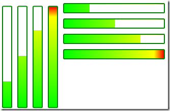
One word of caution. If you plan to plan to use the gradient fill and dock panel technique I described in my blog, then you’ll need another trigger to set the MinWidth property on the Mask element. This allows you to get the gradually revealed gradient fill in either Horizontal or Vertical alignment:

image

I’ve made the XAML for these styles available in a gist on GitHub.