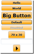
In this post I will demonstrate how to create a custom template for a WPF button using XAML. In particular we will look at being able to have complete control over all the visual states, including disabled, mouse over, mouse down and even the appearance of the focus rectangle.
Stage 1: Creating a style
The first thing to do is to create a Style which sets the properties of the Button that we want to customize. We will put this in the Page.Resources section of our XAML file.
<Style x:Key="OrangeButton" TargetType="Button">
<Setter Property="OverridesDefaultStyle" Value="True"/>
<Setter Property="Margin" Value="2"/>
<Setter Property="FontFamily" Value="Verdana"/>
<Setter Property="FontSize" Value="11px"/>
<Setter Property="FontWeight" Value="Bold"/>
<Setter Property="FocusVisualStyle" Value="{StaticResource MyFocusVisual}" />
<Setter Property="Background" >
   <Setter.Value>
       <LinearGradientBrush StartPoint="0,0" EndPoint="0,1" >
           <GradientStop Color="#FFFFD190" Offset="0.2"/>
           <GradientStop Color="Orange" Offset="0.85"/>
           <GradientStop Color="#FFFFD190" Offset="1"/>
       </LinearGradientBrush>
   </Setter.Value>
</Setter>
This is all fairly straightforward stuff - I am just setting the font and background gradient. The only complicated bit is that I am overriding the focus rectangle drawing, as I want a smaller rectangle than the one that gets drawn by default. So I need another style in my Page.Resources section:
<Style x:Key="MyFocusVisual">
     <Setter Property="Control.Template">
       <Setter.Value>
         <ControlTemplate TargetType="{x:Type Control}">
             <Grid Margin="3 2">
               <Rectangle Name="r1" StrokeThickness="1" Stroke="Black" StrokeDashArray="2 2"/>
               <Border Name="border" Width="{TemplateBinding ActualWidth}" Height="{TemplateBinding ActualHeight}"  CornerRadius="2" BorderThickness="1" />
             </Grid>
         </ControlTemplate>
       </Setter.Value>
     </Setter>
   </Style>
Stage 2: Creating a template
We would already be finished if I just wanted the normal appearance of my button to be changed. But I want complete control - including the appearance in mouse over, mouse down and disabled situations. So a template allows us to completely control what visual elements constitute our control.
Again this goes in Page.Resources. The first part is shown here:
<Setter Property="Template">
   <Setter.Value>
       <ControlTemplate TargetType="Button">
           <Border Name="border"
               BorderThickness="1"
               Padding="4,2"
               BorderBrush="DarkGray"
               CornerRadius="3"
               Background="{TemplateBinding Background}">
               <Grid >
               <ContentPresenter HorizontalAlignment="Center"
                              VerticalAlignment="Center" Name="contentShadow"
                   Style="{StaticResource ShadowStyle}">
                   <ContentPresenter.RenderTransform>
                       <TranslateTransform X="1.0" Y="1.0" />
                   </ContentPresenter.RenderTransform>
               </ContentPresenter>
               <ContentPresenter HorizontalAlignment="Center"
                           VerticalAlignment="Center" Name="content"/>
               </Grid>
           </Border>
Here you can see I have set up a simple border which gives my button rounded corners, a single pixel gray border, and uses the fill from the control's Background property. This means that by default it will use the orange gradient specified in my style, but that users can override this for their own Background.
To draw the content (usually text), we use a ContentPresenter control. I am trying to do something clever here, which is create a bevelled effect on the text by drawing it again in gray. This works fine on text, but for some reason doesn't do anything when the Content is a Shape. I'm not sure why that is. ShadowStyle is defined as follows:
<Style x:Key="ShadowStyle">
   <Setter Property="Control.Foreground" Value="LightGray" />
</Style>
Stage 3: Applying some triggers
Now we need to add some triggers to our Button template so that we can change its appearance on various events.
First is mouse over. When IsMouseOver becomes true, we change the colour of the border and the text colour to blue. Unfortunately, setting the Foreground property does nothing if the content is a shape.
<ControlTemplate.Triggers>
  <Trigger Property="IsMouseOver" Value="True">
     <Setter TargetName="border" Property="BorderBrush" Value="#FF4788c8" />
     <Setter Property="Foreground" Value="#FF4788c8" />
  </Trigger>
Next is mouse down. When IsPressed becomes true, we modify the background gradient so it looks like the button has gone 'down'. I also move the text down one pixel.
<Trigger Property="IsPressed" Value="True">
   <Setter Property="Background" >
   <Setter.Value>
       <LinearGradientBrush StartPoint="0,0" EndPoint="0,1" >
           <GradientStop Color="#FFFFD190" Offset="0.35"/>
           <GradientStop Color="Orange" Offset="0.95"/>
           <GradientStop Color="#FFFFD190" Offset="1"/>
       </LinearGradientBrush>
   </Setter.Value>
   </Setter>
   <Setter TargetName="content" Property="RenderTransform" >
   <Setter.Value>
       <TranslateTransform Y="1.0" />
   </Setter.Value>
   </Setter>
</Trigger>
Third, we draw a dark gray border when a button is focussed or if it is the default button (the button that will be clicked when you press enter).
<Trigger Property="IsDefaulted" Value="True">
   <Setter TargetName="border" Property="BorderBrush" Value="#FF282828" />
</Trigger>
<Trigger Property="IsFocused" Value="True">
   <Setter TargetName="border" Property="BorderBrush" Value="#FF282828" />
</Trigger>
Finally, the when the button is disabled, we gray out the text and wash out the background a little by reducing its opacity.
<Trigger Property="IsEnabled" Value="False">
       <Setter TargetName="border" Property="Opacity" Value="0.7" />
       <Setter Property="Foreground" Value="Gray" />
   </Trigger>
</ControlTemplate.Triggers>
Stage 4: Using the control
Now we are ready to use our control. All we have to do is set the Style property of our button. We can override any of the settings such as font size if we like. The button will automatically resize itself to fit the content.
<StackPanel HorizontalAlignment="Center">
<Button Style="{StaticResource OrangeButton}">Hello</Button>
<Button Style="{StaticResource OrangeButton}">World</Button>
<Button Style="{StaticResource OrangeButton}" FontSize="20">Big Button</Button>
<Button Style="{StaticResource OrangeButton}" IsDefault="True">Default</Button>
<Button Style="{StaticResource OrangeButton}" IsEnabled="False">Disabled</Button>
<Button Style="{StaticResource OrangeButton}" Width="70" Height="30">70 x 30</Button>
<TextBox />
<Button Style="{StaticResource OrangeButton}" Width="30" Height="30">
<Path Fill="Black" Data="M 3,3 l 9,9 l -9,9 Z" />
</Button>
</StackPanel>
Here's what it looks like:

Download an example XAML file here.


