Tuesday 29 April 2008

Parameterized INSERT with VistaDB

I'm continuing learning ASP.NET MVC by writing a very simple blog application using VistaDB as a backend, and basing my architecture loosely on Rob Conery's MVC Storefront screencasts. Today it was time to insert new posts into the database, and although it turned out to be fairly straightforward, I thought I would share the code anyway, as my first few attempts failed. The code shows how to add parameters and how to get the ID of the newly inserted row.

public void CreatePost(Post post)
{
    using (VistaDBConnection connection = new VistaDBConnection(connectionString))
    {
        connection.Open();
        string sql = "INSERT INTO Posts (BlogId, Title, Body, " + 
            "AuthorName, PublishedDate, LastModifiedDate, PublishState, " +
            "Slug) VALUES (@BlogId,@Title,@Body,@AuthorName," +
            "@PublishedDate,@LastModified,@PublishState,@Slug)";
        using (VistaDBCommand command = new VistaDBCommand(sql, connection))
        {
            command.Parameters.Add("@BlogId",post.BlogId);
            command.Parameters.Add("@Title",post.Title);
            command.Parameters.Add("@Body", post.Body);
            command.Parameters.Add("@AuthorName", post.Author);
            command.Parameters.Add("@PublishedDate", post.Published);
            command.Parameters.Add("@LastModified", post.LastModified);
            command.Parameters.Add("@PublishState", post.Status);
            command.Parameters.Add("@Slug", post.Slug);
            
            int rowsAffected = command.ExecuteNonQuery();
            if (rowsAffected != 1)
            {
                throw new InvalidOperationException("Failed to add post");
            }
        }
        using (VistaDBCommand command = new VistaDBCommand("SELECT @@IDENTITY", connection))
        {
            post.Id = (int)command.ExecuteScalar();                
        }
    }
}

Friday 25 April 2008

VistaDB Membership Provider for ASP.NET MVC

The VistaDB Membership Provider

Having got my ASP.NET MVC application up and running with a VistaDB database, my next task was to see if I could get the Membership Provider working. VistaDB claims to come with a ready-made ASP.NET membership provider, so I hoped that it would be nice and easy to plug in to a website.

Unfortunately, it wasn't quite so simple. The VistaDB help file doesn't explain how to use it at all. The source code for the membership provider is included but doesn't compile due to a missing AssemblyInfo.cs file. And the MembershipSample web site that is supposed to demonstrate how to use it is incomplete - it doesn't contain the necessary Provider configuration in web.config and it doesn't provide a sample database.

First Attempt

After a bit of fishing around I found that the VistaDB 3.3 install directory contains aspnetdb.vdb3 which is a blank database for the provider to use. Double-click it to open it in the VistaDB DataBuilder application and you can select Database | Generate Script to create a SQL Script that creates the necessary tables, thereby allowing you to put them into another vdb3 file if you wish.

1. Rather than trying to build the incomplete MembershipProvider solution, I simply copy VistaDB.Web.cs file into my project.

2. I copied the aspnetdb.vdb3 into my App_Data folder. I decided against putting the tables in another database for the time being.

3. Add a connection string to web.config

<connectionStrings>
    <add name="VistaDBMembershipProvider" connectionString="Data Source=|DataDirectory|\aspnetdb.vdb3;Open Mode=NonexclusiveReadWrite"/>
</connectionStrings>

4. Now add an authentication setting to web.config. Since I am using ASP.NET MVC, I am going to specify that the Login page will be in the Admin controller:

<authentication mode="Forms">
   <forms loginUrl="Admin/Login"></forms>
</authentication>

5. Now tell it what membership provider to use, and configure the membership provider:

<membership defaultProvider="VistaDBMembershipProvider">
<providers>
    <add 
        name="VistaDBMembershipProvider" 
        type="VistaDB.Web.Security.VistaDBMembershipProvider"   
        connectionStringName="VistaDBMembershipProvider" 
        applicationName="MyApplication" 
        maxInvalidPasswordAttempts="2"
        passwordAttemptWindow="10"
        minRequiredAlphaNumericCharacters="2"
        minRequiredPasswordLength="8"
        passwordStrengthRegularExpression="" 
        enablePasswordReset="true"
        enablePasswordRetrieval="true"
        requiresQuestionAndAnswer="true" 
        requiresUniqueEmail="true"
        writeExceptionsToEventLog="true"
        passwordFormat="Encrypted"
        />
</providers> 
</membership>

Securing the Site

The next normal thing to do would be to use web.config to indicate which pages are not accessible to unauthenticated users. However, in the world of ASP.NET MVC, the approach is slightly different. Rob Conery has a post on adding action filters.

6. I copied the code for the RequiresAuthenticationAttribute and RequiresRoleAttribute filters. MVC is constantly changing though, and I needed to change instances of FilterExecutingContext to be ActionExecutingContext to get it compiling.

7. So now I needed to test my authentication by putting this attribute on a controller action. I chose my BlogController's Edit action.

[RequiresAuthentication()]
public ActionResult Edit(string id)
{
   return RenderView();
}

8. We also need to create the Login action on our Admin controller. Fredrik Normén had some sample code on his blog which I used as the basis for my Login controller. Again, I found that changes to the MVC framework meant that his code didn't compile as is. Here is what I ended up with:

public ActionResult Login(string userName, string password, string ReturnUrl)
{
    if (this.IsValidLoginArgument(userName, password))
    {
        if (Membership.ValidateUser(userName, password))
            return RedirectFromLoginPage(userName, ReturnUrl);
        else
            this.ViewData["LoginFailed"] = "Login failed! Make sure you have entered the right user name and password!";
    } 
    return RenderView("Login");
} 

private ActionResult RedirectFromLoginPage(string userName, string ReturnUrl)
{
    FormsAuthentication.SetAuthCookie(userName, false); 

    if (!string.IsNullOrEmpty(ReturnUrl))
        return Redirect(ReturnUrl);
    else
        return Redirect(FormsAuthentication.DefaultUrl);
} 

private bool IsValidLoginArgument(string userName, string password)
{
    return !(string.IsNullOrEmpty(userName) && string.IsNullOrEmpty(password));
}

9. I was then able to test my site, and sure enough, we were redirected to the Admin/Login page if we tried to access Blog/Edit/nnn. Of course, login always failed as I hadn't any users. So I selected Project|ASP.NET Configuration in Visual Studio to attempt to add a user with the built-in interface. However, it crashed while trying to create the user.

Greg Obleshchuk to the Rescue

The saga of getting a working ASP.NET Provider for VistaDB was taking up a bit too much of my time for my liking, and I found help in the form of Greg Obleshchuk who had coded his own VistaDB Membership Provider and made it available on the VistaDB forums. Note that you need an account before it will let you download it. The advantage of using his code is that he has also implemented a RolesProvider.

10. I downloaded Greg's provider code, which is implemented in VB. The first task was to create the database tables. Greg had included the CREATE TABLE commands in comments at the top of the source code. But for some reason, they were in a syntax that the VistaDB DataBuilder application didn't accept. I had to replace Guid with UNIQUEIDENTIFIER, Text with NVARCHAR, YesNo with BIT and Integer with INT, before it would let me add the three tables needed for the membership and roles providers. Here is the corrected SQL:

CREATE TABLE [Users]
(
   PKID UniqueIdentifier NOT NULL PRIMARY KEY,
   Username NVARCHAR (255) NOT NULL,
   ApplicationName NVARCHAR (255) NOT NULL,
   Email NVARCHAR (128) NOT NULL,
   Comment NVARCHAR (255),
   Password NVARCHAR (128) NOT NULL,
   PasswordQuestion NVARCHAR (255),
   PasswordAnswer NVARCHAR (255),
   IsApproved BIT, 
   LastActivityDate DateTime,
   LastLoginDate DateTime,
   LastPasswordChangedDate DateTime,
   CreationDate DateTime, 
   IsOnLine BIT,
   IsLockedOut BIT,
   LastLockedOutDate DateTime,
   FailedPasswordAttemptCount INT,
   FailedPasswordAttemptWindowStart DateTime,
   FailedPasswordAnswerAttemptCount INT,
   FailedPasswordAnswerAttemptWindowStart DateTime
 );

CREATE TABLE Roles
(
  Rolename NVARCHAR (255) NOT NULL,
  ApplicationName NVARCHAR (255) NOT NULL,
    CONSTRAINT PKRoles PRIMARY KEY (Rolename, ApplicationName)
);

CREATE TABLE UsersInRoles
(
  Username NVARCHAR (255) NOT NULL,
  Rolename NVARCHAR (255) NOT NULL,
  ApplicationName NVARCHAR (255) NOT NULL,
  CONSTRAINT PKUsersInRoles PRIMARY KEY (Username, Rolename, ApplicationName)
);

11. My next idea was simply to put the provider VB files into a folder in my website, but for some reason, Visual Studio insisted on compiling them as C# so I was forced to create a separate assembly for the providers.

12. After creating my new VistaDBProviders assembly (my first ever VB.NET assembly!), I then ran into more problems. My website didn't seem able to create instances of the providers no matter what I did in the web.config. After trying strong naming my assembly, I eventually discovered using Reflector that VB.NET automatically adds the name of your assembly as a namespace prefix to all classes. Once I had that worked out, the relevant lines in my web.config were as follows:

<add assembly="VistaDBProviders, Version=1.0.0.0, Culture=neutral, PublicKeyToken=919ca070305cc370"/> 
...
<providers>
  <add
      name="VistaDBMembershipProvider"
      type="VistaDBProviders.VistaDBMembershipProvider" 

13. My troubles weren't quite over. I discovered I needed to generate a MachineKey to be able to use encrypted passwords. I had had enough of messing around for one day so I decided go with passwordFormat="Clear"

Success at Last

Having done all this, I was finally able create a user using Project | ASP.NET Configuration and additionally could assign some roles. It would be nice if future drops of VistaDB could make this process a lot more streamlined, and include a Roles Provider as well.

Connecting to VistaDB in ASP.NET

I have been looking at the ASP.NET MVC extensions recently, and as a database for my test project, I decided to check out VistaDB. VistaDB is a fully managed lightweight alternative to SQL Server, and is available in a free express edition.

The benefits of VistaDB are that it the SQL is compatible with SQL-Server, and you can deploy your database as a single file in your App_Data folder. This is a big benefit for me, as it makes backing up a site trivial. It comes with a reasonably well featured utility for you to explore and modify your vdb3 files.

The only slight disappointment was the documentation was lacking a quickstart for absolute beginners, so it required a few google searches to get me up and running.

To use VistaDB with your website:

  1. Add references to VistaDB.NET20 and VistaDB.Web (I also copied them to my bin folder, but I think VS would have done this automatically)
  2. Create a vdb3 file and put it in your App_Data folder
  3. Now you can open a connection and query it using code similar to the following:
string connectionString = "Data Source=|DataDirectory|\\Database.vdb3;Open Mode = NonexclusiveReadWrite;";

using (VistaDBConnection connection = new VistaDBConnection(connectionString))
{
    connection.Open();
    VistaDBCommand command = new VistaDBCommand("SELECT * FROM Posts", connection);
    VistaDBDataReader reader = command.ExecuteReader();
    while (reader.Read())
    {
        Post post = new Post
        {
            Body = (string)reader["Body"],
            Author = (string)reader["AuthorName"],
            Published = (DateTime)reader["PublishedDate"],
            Status = (PublishStatus)reader["PublishState"],
            Title = (string)reader["Title"]
        };
        yield return post;
    }
}

And that was all there was to it. My next task is to work out how to use the VistaDB MembershipProvider, which is another area that is somewhat lacking in documentation. I'll post a how-to here once I have got things up and running.

Thursday 24 April 2008

Branching and Merging Anti-Patterns

I came across a helpful article on MSDN today, on the subject of branching and merging in source control. What grabbed my attention was a list of "branching and merging anti-patterns". Sadly, my current company is guilty of a few of these. Here's the list from the article:

You know you are on the wrong track if you experience one or more of the following symptoms in your development environment:

  • Merge Paranoia—avoiding merging at all cost, usually because of a fear of the consequences.
  • Merge Mania—spending too much time merging software assets instead of developing them.
  • Big Bang Merge—deferring branch merging to the end of the development effort and attempting to merge all branches simultaneously.
  • Never-Ending Merge—continuous merging activity because there is always more to merge.
  • Wrong-Way Merge—merging a software asset version with an earlier version.
  • Branch Mania—creating many branches for no apparent reason.
  • Cascading Branches—branching but never merging back to the main line.
  • Mysterious Branches—branching for no apparent reason.
  • Temporary Branches—branching for changing reasons, so the branch becomes a permanent temporary workspace.
  • Volatile Branches—branching with unstable software assets shared by other branches or merged into another branch.
    • Note   Branches are volatile most of the time while they exist as independent branches. That is the point of having them. The difference is that you should not share or merge branches while they are in an unstable state.
  • Development Freeze—stopping all development activities while branching, merging, and building new base lines.
  • Berlin Wall—using branches to divide the development team members, instead of dividing the work they are performing.

The most costly I would say is a "development freeze" which can leave whole teams of developers unproductive for weeks at a time.

The most common one I have run into is probably "merge paranoia". Some developers are adamant that the source control software is riddled with bugs that will ruin your work given the slightest opportunity. They couldn't possibly have used the tool wrong. Thus multiple checkouts are often disabled, and branches are never merged back into the tip - bug-fixes are done twice.

As for "branch mania", what can I say? Some managers just seem to sleep easier if they know there was a branch made, "just in case" we need it.

And if there is perhaps one missing, I would add "wrong way branch", where a branch is made and then the tip is renamed so that the branch can take over the project name of the original tip. Guaranteed to cause pain if anything was checked out before this hare-brained scheme is put into effect.

Wednesday 23 April 2008

Thoughts on Live Mesh

I've been watching some videos today on Microsoft's new Live Mesh platform. I have to say that this looks like it has potential to be really good. I've avoided a lot of the Microsoft Live offerings so far, but this is the first one that I am really looking forward to trying out.

Folder Synchronization

Having recently bought a laptop, the challenge of keeping data synchronized between the three computers I use has become quite difficult. I am overly reliant on a 2GB USB stick that would be a disaster if I lost. I use Google Docs quite a lot as well, but don't want to store things on there that I could not do without if I lost Internet connectivity.

So not only will Live Mesh give the benefit of making it very easy to access all my source code, music, photos and documents from any of the computers I use, but it also has a superb secondary benefit of allowing offsite backups of all my most important data. Last year I lost quite a few MP3s due to a blunder reinstalling Windows XP, but I was fortunately able to restore most of them thanks to them being on my work PC. If I had been using folder synchronization, everything would have been recovered.

Remote Desktop Access

Another great feature is the remote desktop access available from any web browser. This is another killer feature, and while it isn't one that I would be using a lot, there are plenty of scenarios where it would save me a huge amount of time.

For example, my ISP rather annoyingly blocks FTP access to my webspace unless I am connecting via my home broadband connection. This means that if I want to make a minor tweak to my site during my lunch hour at work, or while I am on holiday I can't.

It's a Platform

The Microsoft employees were keen to emphasise that Live Mesh is not really about folder sharing and remote desktop access but that it is a platform for future applications to be built on. A good example of a possible future application would be a web browser bookmark synchronizer.

I guess how much it takes off will depend upon how easy it is to program for the platform, and how easy it is for end users to sign up. I will have to wait and see because there is a waiting list at the moment.

Will it work?

Obviously, there are file sharing and remote desktop applications already out there. The success of Live Mesh will be based on whether you can simply install it and it "just works". I do have a couple of concerns though...

1. Capacity

Currently Microsoft are offering 5GB free space. This is of course very generous, but obviously could be used up very quickly. In the video they suggested that eventually it would be possible to synchronize between computers but not store things in the cloud, but that at first you would always have to use the cloud. I would think they need to remove this limitation as soon as possible.

Secondly, if the service could offer additional storage space for a suitably modest fee, this could become ideal for offsite backup.

2. Merging

None of the videos I watched said anything about merging and conflicts. It would be interesting to know what the intention is on this front.

3. Bandwidth

My biggest concern is with bandwidth. My ISP gives me 8GB per month with unlimited downloads overnight. Some laptop users have USB modems that transmit data over mobile phone networks and have even more restricted monthly bandwidth.

I guess once you have performed the initial sync of your folders, bandwidth use would not necessarily be too high, but it would be very useful to be able to throttle bandwidth, or even schedule syncing to be at certain times, with only files that are needed being synchronised at other times. It would also be good if it had the intelligence to synchronise computers that are on the same LAN without going through the Internet. Otherwise I could see myself using my entire month's bandwidth up within a day or so of installing the software.

Anyway, those are my thoughts. What about you? Are you planning to use Live Mesh?

Wednesday 16 April 2008

Styling a ListBox in Silverlight (Part 3 - Item Style)

This post describes how to style a ListBox in Silverlight 2 beta 1. For an updated version for beta 2, please look here

In my last post, I demonstrated how to completely customise the appearance of a ListBox in Silverlight, including the appearance of the ScrollBars. The missing piece though is any kind of indication of which items are selected, or any visual feedback when the mouse hovers over a ListBox item.

To achieve this we need to add some Storyboards to the custom ListBoxItem we created in my first post. There are six states you can specify Storyboards for. The most important for our purposes are "Normal State", "Normal Selected State", "MouseOver State" and "MouseOver Selected State".

Obviously you can do whatever you like in these Storyboards. I have gone for the simplest option of changing the background. But if you wished to animate some properties on the ContentPresenter itself, then that also would be possible.

Here's the updated ListBoxItem style:

<Style x:Key="ListBoxItemStyle1" TargetType="ListBoxItem">
    <Setter Property="Foreground" Value="#BDBC97" />    
    <Setter Property="Template">
        <Setter.Value>
            <ControlTemplate TargetType="ListBoxItem">
                <Grid x:Name="RootElement">
                    <Grid.Resources>
                        <Storyboard x:Key="Normal State" />
                        <!-- <Storyboard x:Key="Unfocused Selected State"/> -->
                        <Storyboard x:Key="Normal Selected State">
                            <ColorAnimation Storyboard.TargetName="BackgroundBrush" Storyboard.TargetProperty="Color" Duration="0" To="#FF397F8F"/>
                        </Storyboard>
                        <Storyboard x:Key="MouseOver State">
                            <ColorAnimation Storyboard.TargetName="BackgroundBrush" Storyboard.TargetProperty="Color" Duration="0" To="#FF898A8A"/>
                        </Storyboard>
                        <!-- <Storyboard x:Key="MouseOver Unfocused Selected State"/> -->
                        <Storyboard x:Key="MouseOver Selected State">
                            <ColorAnimation Storyboard.TargetName="BackgroundBrush" Storyboard.TargetProperty="Color" Duration="0" To="#FF898A8A"/>
                        </Storyboard>
                    </Grid.Resources>                        
                
                    <Border CornerRadius="5" Margin="1">
                        <Border.Background>
                            <SolidColorBrush x:Name="BackgroundBrush" Color="#51615B" />
                        </Border.Background>
                        <ContentPresenter
                            Margin="5,1"
                            Content="{TemplateBinding Content}"
                            Foreground="{TemplateBinding Foreground}"
                         />                    
                    </Border>
                </Grid>
            </ControlTemplate>
        </Setter.Value>
    </Setter>
</Style>

Here's what it looks like (item 3 selected, item 5 mouse over):

ListBox style

OK, so my choice of colours is awful and there are lots of visual elements that could be improved (and also we await a fix in beta 2 to the vertical scrollbar bug), but hopefully I have demonstrated how it is possible to completely change every visual element of how your ListBox is rendered in Silverlight.

Here's the complete XAML for my test application including all the custom styles:

<UserControl
    xmlns="http://schemas.microsoft.com/client/2007"
    xmlns:x="http://schemas.microsoft.com/winfx/2006/xaml"
    x:Class="Silverlight2BlendApplication.Page"
    Width="640" Height="480" 
    xmlns:d="http://schemas.microsoft.com/expression/blend/2008" 
    xmlns:mc="http://schemas.openxmlformats.org/markup-compatibility/2006" 
    mc:Ignorable="d" xmlns:System="clr-namespace:System;assembly=mscorlib" xmlns:Silverlight2BlendApplication="clr-namespace:Silverlight2BlendApplication">
    <UserControl.Resources>
        
        <Style TargetType="ScrollBar" x:Key="ScrollBarStyle1">
            <!-- Any other properties you want to set -->
            <Setter Property="Template">
                <Setter.Value>
                    <ControlTemplate TargetType="ScrollBar">
                        <Grid x:Name="RootElement">
                            <!-- States -->
                            <Grid.Resources>
                                <!-- Transition to the slider's default state -->
                                <Storyboard x:Key="Normal State">
                                    <DoubleAnimation Duration="0:0:0" Storyboard.TargetName="RootElement" Storyboard.TargetProperty="Opacity" To="1" />
                                </Storyboard>

                                <!-- Transition to the slider's mouseover state -->
                                <Storyboard x:Key="MouseOver State">
                                    <DoubleAnimation Duration="0:0:0" Storyboard.TargetName="RootElement" Storyboard.TargetProperty="Opacity" To="1" />
                                </Storyboard>

                                <!-- Transition to the slider's disabled state -->
                                <Storyboard x:Key="Disabled State">
                                    <DoubleAnimation Duration="0:0:0" Storyboard.TargetName="RootElement" Storyboard.TargetProperty="Opacity" To="0.5" />
                                </Storyboard>

                                <!-- RepeatButton Templates -->
                                <ControlTemplate x:Key="RepeatButtonTemplate">
                                    <Grid x:Name="RootElement" Background="Transparent" />
                                </ControlTemplate>

                                <ControlTemplate x:Key="HorizontalIncrementTemplate">
                                    <Grid x:Name="RootElement" Background="#00000000">
                                        <Grid.Resources>
                                            <Storyboard x:Key="Normal State" />
                                            <Storyboard x:Key="MouseOver State">
                                                <ColorAnimation Duration="0:0:0.2" Storyboard.TargetName="ButtonColor" Storyboard.TargetProperty="Color" To="#FF557E9A" />
                                            </Storyboard>
                                            <Storyboard x:Key="Disabled State">
                                                <DoubleAnimation Duration="0:0:0" Storyboard.TargetName="ButtonVisual" Storyboard.TargetProperty="Opacity" To=".6" />
                                            </Storyboard>
                                        </Grid.Resources>
                                        <Grid.ColumnDefinitions>
                                            <ColumnDefinition Width="35*"/>
                                            <ColumnDefinition Width="30*"/>
                                            <ColumnDefinition Width="35*"/>
                                        </Grid.ColumnDefinitions>
                                        <Grid.RowDefinitions>
                                            <RowDefinition Height="25*"/>
                                            <RowDefinition Height="50*"/>
                                            <RowDefinition Height="25*"/>
                                        </Grid.RowDefinitions>
                                        <Path x:Name="ButtonVisual" Grid.Column="1" Grid.Row="1" Stretch="Fill" Data="F1 M 511.047,352.682L 511.047,342.252L 517.145,347.467L 511.047,352.682 Z ">
                                            <Path.Fill>
                                                <SolidColorBrush x:Name="ButtonColor" Color="#FF313131" />
                                            </Path.Fill>
                                        </Path>
                                        <Rectangle x:Name="FocusVisualElement" Grid.ColumnSpan="3" Grid.RowSpan="3"  Stroke="#666666" Fill="#00000000"  StrokeDashArray=".2 5" StrokeDashCap="Round" IsHitTestVisible="false" Opacity="0" />
                                    </Grid>
                                </ControlTemplate>

                                <ControlTemplate x:Key="HorizontalDecrementTemplate">
                                    <Grid x:Name="RootElement" Background="#00000000">
                                        <Grid.Resources>
                                            <Storyboard x:Key="Normal State" />
                                            <Storyboard x:Key="MouseOver State">
                                                <ColorAnimation Duration="0:0:0.2" Storyboard.TargetName="ButtonColor" Storyboard.TargetProperty="Color" To="#FF557E9A" />
                                            </Storyboard>
                                            <Storyboard x:Key="Disabled State">
                                                <DoubleAnimation Duration="0:0:0" Storyboard.TargetName="ButtonVisual" Storyboard.TargetProperty="Opacity" To=".6" />
                                            </Storyboard>
                                        </Grid.Resources>
                                        <Grid.ColumnDefinitions>
                                            <ColumnDefinition Width="35*"/>
                                            <ColumnDefinition Width="30*"/>
                                            <ColumnDefinition Width="35*"/>
                                        </Grid.ColumnDefinitions>
                                        <Grid.RowDefinitions>
                                            <RowDefinition Height="25*"/>
                                            <RowDefinition Height="50*"/>
                                            <RowDefinition Height="25*"/>
                                        </Grid.RowDefinitions>
                                        <Path Grid.Column="1" Grid.Row="1" Stretch="Fill" Data="F1 M 110.692,342.252L 110.692,352.682L 104.594,347.467L 110.692,342.252 Z ">
                                            <Path.Fill>
                                                <SolidColorBrush x:Name="ButtonColor" Color="#FF313131" />
                                            </Path.Fill>
                                        </Path>
                                        <Rectangle x:Name="FocusVisualElement" Grid.ColumnSpan="3" Grid.RowSpan="3"  Stroke="#666666" Fill="#00000000"  StrokeDashArray=".2 5" StrokeDashCap="Round" IsHitTestVisible="false" Opacity="0" />
                                    </Grid>
                                </ControlTemplate>

                                <ControlTemplate x:Key="VerticalIncrementTemplate">
                                    <Grid x:Name="RootElement" Background="#00000000">
                                        <Grid.Resources>
                                            <Storyboard x:Key="Normal State" />
                                            <Storyboard x:Key="MouseOver State"> 
                                                <ColorAnimation Duration="0:0:0.2" Storyboard.TargetName="ButtonColor" Storyboard.TargetProperty="Color" To="#FF557E9A" />
                                            </Storyboard>
                                            <Storyboard x:Key="Disabled State">
                                                <DoubleAnimation Duration="0:0:0" Storyboard.TargetName="ButtonVisual" Storyboard.TargetProperty="Opacity" To=".6" />
                                            </Storyboard>
                                        </Grid.Resources>
                                        <Grid.ColumnDefinitions>
                                            <ColumnDefinition Width="25*"/>
                                            <ColumnDefinition Width="50*"/>
                                            <ColumnDefinition Width="25*"/>
                                        </Grid.ColumnDefinitions>
                                        <Grid.RowDefinitions>
                                            <RowDefinition Height="35*"/>
                                            <RowDefinition Height="30*"/>
                                            <RowDefinition Height="35*"/>
                                        </Grid.RowDefinitions>
                                        <Path Grid.Column="1" Grid.Row="1" Stretch="Fill" Data="F1 M 531.107,321.943L 541.537,321.943L 536.322,328.042L 531.107,321.943 Z ">
                                            <Path.Fill>
                                                <SolidColorBrush x:Name="ButtonColor" Color="#FF313131" />
                                            </Path.Fill>
                                        </Path>
                                        <Rectangle x:Name="FocusVisualElement" Grid.ColumnSpan="3" Grid.RowSpan="3"  Stroke="#666666" Fill="#00000000"  StrokeDashArray=".2 5" StrokeDashCap="Round" IsHitTestVisible="false" Opacity="0" />
                                    </Grid>
                                </ControlTemplate>

                                <ControlTemplate x:Key="VerticalDecrementTemplate">
                                    <Grid x:Name="RootElement" Background="#00000000">
                                        <Grid.Resources>
                                            <Storyboard x:Key="Normal State" />
                                            <Storyboard x:Key="MouseOver State">
                                                <ColorAnimation Duration="0:0:0.2" Storyboard.TargetName="ButtonColor" Storyboard.TargetProperty="Color" To="#FF557E9A" />
                                            </Storyboard>
                                            <Storyboard x:Key="Disabled State">
                                                <DoubleAnimation Duration="0:0:0" Storyboard.TargetName="ButtonVisual" Storyboard.TargetProperty="Opacity" To=".6" />
                                            </Storyboard>
                                        </Grid.Resources>
                                        <Grid.ColumnDefinitions>
                                            <ColumnDefinition Width="25*"/>
                                            <ColumnDefinition Width="50*"/>
                                            <ColumnDefinition Width="25*"/>
                                        </Grid.ColumnDefinitions>
                                        <Grid.RowDefinitions>
                                            <RowDefinition Height="35*"/>
                                            <RowDefinition Height="30*"/>
                                            <RowDefinition Height="35*"/>
                                        </Grid.RowDefinitions>
                                        <Path Grid.Column="1" Grid.Row="1" Stretch="Fill" Data="F1 M 541.537,173.589L 531.107,173.589L 536.322,167.49L 541.537,173.589 Z ">
                                            <Path.Fill>
                                                <SolidColorBrush x:Name="ButtonColor" Color="#FF313131" />
                                            </Path.Fill>
                                        </Path>
                                        <Rectangle x:Name="FocusVisualElement" Grid.ColumnSpan="3" Grid.RowSpan="3"  Stroke="#666666" Fill="#00000000"  StrokeDashArray=".2 5" StrokeDashCap="Round" IsHitTestVisible="false" Opacity="0" />
                                    </Grid>
                                </ControlTemplate>

                                <!-- Thumb Templates -->
                                <ControlTemplate x:Key="VerticalThumbTemplate">
                                    <Grid x:Name="RootElement">
                                        <Grid.Resources>
                                            <!--Colors -->
                                            <Color x:Key="ThumbForegroundColor">#ACAC39</Color>
                                            <Color x:Key="ThumbHoverColor">#73AC39</Color>
                                            <!--Storyboards-->
                                            <Storyboard x:Key="Normal State" />
                                            <Storyboard x:Key="MouseOver State">
                                                <ColorAnimation Duration="0:0:0.1" Storyboard.TargetName="ThumbForeground" Storyboard.TargetProperty="Color" To="{StaticResource ThumbHoverColor}" />
                                            </Storyboard>
                                            <Storyboard x:Key="Disabled State">
                                                <DoubleAnimation Duration="0:0:0" Storyboard.TargetName="ThumbForeground" Storyboard.TargetProperty="Opacity" To="0" />
                                            </Storyboard>
                                        </Grid.Resources>
                                        <Grid x:Name="ThumbVisual">
                                            <Rectangle x:Name="Background" Margin="3.5,.5,3.5,.5" RadiusX="5" RadiusY="5" >
                                                <Rectangle.Fill>
                                                    <SolidColorBrush x:Name="ThumbForeground" Color="{StaticResource ThumbForegroundColor}" />
                                                </Rectangle.Fill>
                                            </Rectangle>
                                        </Grid>
                                    </Grid>
                                </ControlTemplate>

                                <ControlTemplate x:Key="HorizontalThumbTemplate">
                                    <Grid x:Name="RootElement">
                                        <Grid.Resources>
                                            <!--Colors-->
                                            <Color x:Key="ThumbForegroundColor">#ACAC39</Color>
                                            <Color x:Key="ThumbHoverColor">#73AC39</Color>
                                            <!--Storyboards-->
                                            <Storyboard x:Key="Normal State" />
                                            <Storyboard x:Key="MouseOver State">
                                                <ColorAnimation Duration="0:0:0.1" Storyboard.TargetName="ThumbForeground" Storyboard.TargetProperty="Color" To="{StaticResource ThumbHoverColor}" />
                                            </Storyboard>
                                            <Storyboard x:Key="Disabled State">
                                                <DoubleAnimation Duration="0:0:0" Storyboard.TargetName="ThumbForeground" Storyboard.TargetProperty="Opacity" To="0" />
                                            </Storyboard>
                                        </Grid.Resources>
                                        <Grid x:Name="ThumbVisual">
                                            <Rectangle x:Name="Background" Margin=".5,3.5,.5,3.5" RadiusX="5" RadiusY="5" >
                                                <Rectangle.Fill>
                                                    <SolidColorBrush x:Name="ThumbForeground" Color="{StaticResource ThumbForegroundColor}" />
                                                </Rectangle.Fill>
                                            </Rectangle>
                                        </Grid>
                                    </Grid>
                                </ControlTemplate>
                            </Grid.Resources>

                            <!-- Horizontal Template -->
                            <Grid x:Name="HorizontalRootElement" >
                                <Grid.ColumnDefinitions>
                                    <ColumnDefinition Width="Auto" />
                                    <ColumnDefinition Width="Auto" />
                                    <ColumnDefinition Width="Auto" />
                                    <ColumnDefinition Width="*" />
                                    <ColumnDefinition Width="Auto" />
                                </Grid.ColumnDefinitions>

                                <Grid.RowDefinitions>
                                    <RowDefinition />
                                    <RowDefinition />
                                </Grid.RowDefinitions>

                                <!-- Track Layer -->
                                <Rectangle Margin="0,6,0,6" Grid.RowSpan="2" Grid.Column="1" Grid.ColumnSpan="3" Fill="#FF404040" RadiusX="3" RadiusY="3" />

                                <!-- Repeat Buttons + Thumb -->
                                <RepeatButton x:Name="HorizontalSmallDecreaseElement" Grid.Column="0" Grid.RowSpan="2" Width="16" IsTabStop="False" Interval="50" Template="{StaticResource HorizontalDecrementTemplate}" />
                                <RepeatButton x:Name="HorizontalLargeDecreaseElement" Grid.Column="1" Grid.RowSpan="2" Width="0" Template="{StaticResource RepeatButtonTemplate}" Interval="50" IsTabStop="False" />
                                <Thumb x:Name="HorizontalThumbElement" MinWidth="10" Width="20" Grid.Column="2" Grid.RowSpan="2" Template="{StaticResource HorizontalThumbTemplate}" />
                                <RepeatButton x:Name="HorizontalLargeIncreaseElement" Grid.Column="3" Grid.RowSpan="2" Template="{StaticResource RepeatButtonTemplate}" Interval="50" IsTabStop="False" />
                                <RepeatButton x:Name="HorizontalSmallIncreaseElement" Grid.Column="4" Grid.RowSpan="2" Width="16" IsTabStop="False" Interval="50" Template="{StaticResource HorizontalIncrementTemplate}" />
                            </Grid>

                            <!-- Vertical Template -->
                            <Grid x:Name="VerticalRootElement" Visibility="Collapsed">
                                <Grid.RowDefinitions>
                                    <RowDefinition Height="Auto" />
                                    <RowDefinition Height="Auto" />
                                    <RowDefinition Height="Auto" />
                                    <RowDefinition Height="*" />
                                    <RowDefinition Height="Auto" />
                                </Grid.RowDefinitions>

                                <Grid.ColumnDefinitions>
                                    <ColumnDefinition />
                                    <ColumnDefinition />
                                </Grid.ColumnDefinitions>

                                <!-- Track Layer -->
                                <Rectangle Margin="6,0,6,0" Grid.ColumnSpan="2" Grid.Row="1" Grid.RowSpan="3" Fill="#FF404040" RadiusX="3" RadiusY="3" />

                                <!-- Repeat Buttons + Thumb -->
                                <RepeatButton x:Name="VerticalSmallDecreaseElement" Grid.Row="0" Grid.ColumnSpan="2" Height="16" IsTabStop="False" Interval="50" Template="{StaticResource VerticalDecrementTemplate}" />
                                <RepeatButton x:Name="VerticalLargeDecreaseElement" Grid.Row="1" Grid.ColumnSpan="2" Height="0" Template="{StaticResource RepeatButtonTemplate}" Interval="50" IsTabStop="False" />
                                <Thumb x:Name="VerticalThumbElement" MinHeight="10" Height="20" Grid.Row="2" Grid.ColumnSpan="2" Template="{StaticResource VerticalThumbTemplate}" />
                                <RepeatButton x:Name="VerticalLargeIncreaseElement" Grid.Row="3" Grid.ColumnSpan="2" Template="{StaticResource RepeatButtonTemplate}" Interval="50" IsTabStop="False" />
                                <RepeatButton x:Name="VerticalSmallIncreaseElement" Grid.Row="4" Grid.ColumnSpan="2" Height="16" IsTabStop="False" Interval="50" Template="{StaticResource VerticalIncrementTemplate}" />
                            </Grid>
                        </Grid>
                    </ControlTemplate>
                </Setter.Value>
            </Setter>
        </Style>        
        
        <Style TargetType="ScrollViewer" x:Key="ScrollViewerStyle1">
            <Setter Property="Template">
                <Setter.Value>
                    <ControlTemplate TargetType="ScrollViewer">
                        <Border>
                            <Grid Background="{TemplateBinding Background}">
                                <Grid.ColumnDefinitions>
                                    <ColumnDefinition Width="*"/>
                                    <ColumnDefinition Width="Auto"/>
                                </Grid.ColumnDefinitions>
                                <Grid.RowDefinitions>
                                    <RowDefinition Height="*"/>
                                    <RowDefinition Height="Auto"/>
                                </Grid.RowDefinitions>
                                <ScrollContentPresenter
                                  x:Name="ScrollContentPresenterElement"
                                  Grid.Column="0"
                                  Grid.Row="0"
                                  Content="{TemplateBinding Content}"
                                  ContentTemplate="{TemplateBinding ContentTemplate}"
                                  Cursor="{TemplateBinding Cursor}"
                                  Background="{TemplateBinding Background}"
                                  FontFamily="{TemplateBinding FontFamily}"
                                  FontSize="{TemplateBinding FontSize}"
                                  FontStretch="{TemplateBinding FontStretch}"
                                  FontStyle="{TemplateBinding FontStyle}"
                                  FontWeight="{TemplateBinding FontWeight}"
                                  Foreground="{TemplateBinding Foreground}"
                                  HorizontalContentAlignment="{TemplateBinding HorizontalContentAlignment}"
                                  TextAlignment="{TemplateBinding TextAlignment}"
                                  TextDecorations="{TemplateBinding TextDecorations}"
                                  TextWrapping="{TemplateBinding TextWrapping}"
                                  VerticalContentAlignment="{TemplateBinding VerticalContentAlignment}"
                                  Margin="{TemplateBinding Padding}"
                                   />
                                <ScrollBar
                                  x:Name="VerticalScrollBarElement"
                                  Grid.Column="1"
                                  Grid.Row="0"
                                  Orientation="Vertical"
                                  Cursor="Arrow"
                                  Visibility="{TemplateBinding ComputedVerticalScrollBarVisibility}"
                                  ViewportSize="{TemplateBinding ViewportHeight}"
                                  Minimum="0"
                                  Maximum="{TemplateBinding ScrollableHeight}"
                                  Value="{TemplateBinding VerticalOffset}" 
                                  Style="{StaticResource ScrollBarStyle1}"
                                  Width="18"/>
                                <ScrollBar
                                  x:Name="HorizontalScrollBarElement"
                                  Grid.Column="0"
                                  Grid.Row="1"
                                  Orientation="Horizontal"
                                  Cursor="Arrow"
                                  Visibility="{TemplateBinding ComputedHorizontalScrollBarVisibility}"
                                  ViewportSize="{TemplateBinding ViewportWidth}"
                                  Minimum="0"
                                  Maximum="{TemplateBinding ScrollableWidth}"
                                  Value="{TemplateBinding HorizontalOffset}" 
                                  Style="{StaticResource ScrollBarStyle1}"
                                  Height="18"/>
                            </Grid>
                        </Border>
                    </ControlTemplate>
                </Setter.Value>
            </Setter>
        </Style>
        
        <Style x:Key="ListBoxItemStyle1" TargetType="ListBoxItem">
            <Setter Property="Foreground" Value="#BDBC97" />    
            <Setter Property="Template">
                <Setter.Value>
                    <ControlTemplate TargetType="ListBoxItem">
                        <Grid x:Name="RootElement">
                            <Grid.Resources>
                                <Storyboard x:Key="Normal State" />
                                <!-- <Storyboard x:Key="Unfocused Selected State"/> -->
                                <Storyboard x:Key="Normal Selected State">
                                    <ColorAnimation Storyboard.TargetName="BackgroundBrush" Storyboard.TargetProperty="Color" Duration="0" To="#FF397F8F"/>
                                </Storyboard>
                                <Storyboard x:Key="MouseOver State">
                                    <ColorAnimation Storyboard.TargetName="BackgroundBrush" Storyboard.TargetProperty="Color" Duration="0" To="#FF898A8A"/>
                                </Storyboard>
                                <!-- <Storyboard x:Key="MouseOver Unfocused Selected State"/> -->
                                <Storyboard x:Key="MouseOver Selected State">
                                    <ColorAnimation Storyboard.TargetName="BackgroundBrush" Storyboard.TargetProperty="Color" Duration="0" To="#FF898A8A"/>
                                </Storyboard>
                            </Grid.Resources>                        
                        
                            <Border CornerRadius="5" Margin="1">
                                <Border.Background>
                                    <SolidColorBrush x:Name="BackgroundBrush" Color="#51615B" />
                                </Border.Background>
                                <ContentPresenter
                                    Margin="5,1"
                                    Content="{TemplateBinding Content}"
                                    Foreground="{TemplateBinding Foreground}"
                                 />                    
                            </Border>
                        </Grid>
                    </ControlTemplate>
                </Setter.Value>
            </Setter>
        </Style>
        
        <Style x:Key="ListBoxStyle1" TargetType="ListBox">
            <Setter Property="ItemContainerStyle" Value="{StaticResource ListBoxItemStyle1}" />            
            <Setter Property="Template">
                <Setter.Value>
                    <ControlTemplate TargetType="ListBox">        
                        <Grid x:Name="LayoutRoot">
                            <Border Padding="3" Background="#E6BB8A" CornerRadius="5">
                                <ScrollViewer x:Name="ScrollViewerElement" 
                                    Style="{StaticResource ScrollViewerStyle1}"
                                    Padding="{TemplateBinding Padding}">                                
                                    <ItemsPresenter />
                                </ScrollViewer>
                            </Border>
                        </Grid>
                    </ControlTemplate>
                </Setter.Value>
            </Setter>
        </Style>

    </UserControl.Resources>

    <Grid x:Name="LayoutRoot" Background="White" >    
        <ListBox 
            HorizontalAlignment="Left" 
            Margin="8,8,0,0" 
            VerticalAlignment="Top" 
            Style="{StaticResource ListBoxStyle1}" Width="162" Height="161"    
            >
            <ListBoxItem Content="Hello"/>
            <ListBoxItem Content="World"/>
            <ListBoxItem Content="Item 3"/>
            <ListBoxItem Content="Item 4 with a really long name"/>
            <ListBoxItem Content="Item 5"/>
            <ListBoxItem Content="Item 6"/>
            <ListBoxItem Content="Item 7"/>
            <ListBoxItem Content="Item 8"/>
            <ListBoxItem Content="Item 9 out of bounds"/>
            <ListBoxItem Content="Item 10 out of bounds"/>
        </ListBox>
    </Grid>
</UserControl>

Tuesday 15 April 2008

Styling a ListBox in Silverlight (Part 2 - Scrollbars)

This post describes how to style a ListBox in Silverlight 2 beta 1. For an updated version for beta 2, please look here.

In my first post, I explained how to create a very basic ListBox and ListBoxItem style that governed the appearance of a ListBox. It is still very rudimentary though, and doesn't give any visual feedback of selected items or mouse over. It also doesn't have any scrollbars.

Styling a ListBox step 1

Adding scrollbars is actually quite simple. All we need to do is add a ScrollViewer to our ListBox style.

<Border Padding="3" Background="#E6BB8A" CornerRadius="5">
    <ScrollViewer x:Name="ScrollViewerElement" 
        Padding="{TemplateBinding Padding}">
        <ItemsPresenter />
    </ScrollViewer>
</Border>

Which gives us scrollbars:

Styling a ListBox step 2

Unfortunately, as nice as the default scrollbars look, they do not fit at all with the visual theme of our ListBox. We need another style which we will base on the default ScrollViewer style.

Unfortunately, Expression Blend seems to have a problem rendering anything using the default ScrollViewer style, so at this point I was slowed down by having to build and run my application to see the effects of any changes.

I started off by removing the one pixel border width around the whole scrollbar. Also, I hid the little grey square in the corner.

Here's the ScrollViewer template. It looks a little intimidating because I left in most of the stuff from the default ScrollViewer style. We could have got rid of a lot of it, but as we are not planning to customise this part very much, we will leave it in there.

<Style TargetType="ScrollViewer" x:Key="ScrollViewerStyle1">
    <Setter Property="Template">
        <Setter.Value>
            <ControlTemplate TargetType="ScrollViewer">
                <Border>
                    <Grid Background="{TemplateBinding Background}">
                        <Grid.ColumnDefinitions>
                            <ColumnDefinition Width="*"/>
                            <ColumnDefinition Width="Auto"/>
                        </Grid.ColumnDefinitions>
                        <Grid.RowDefinitions>
                            <RowDefinition Height="*"/>
                            <RowDefinition Height="Auto"/>
                        </Grid.RowDefinitions>
                        <ScrollContentPresenter
                          x:Name="ScrollContentPresenterElement"
                          Grid.Column="0"
                          Grid.Row="0"
                          Content="{TemplateBinding Content}"
                          ContentTemplate="{TemplateBinding ContentTemplate}"
                          Cursor="{TemplateBinding Cursor}"
                          Background="{TemplateBinding Background}"
                          FontFamily="{TemplateBinding FontFamily}"
                          FontSize="{TemplateBinding FontSize}"
                          FontStretch="{TemplateBinding FontStretch}"
                          FontStyle="{TemplateBinding FontStyle}"
                          FontWeight="{TemplateBinding FontWeight}"
                          Foreground="{TemplateBinding Foreground}"
                          HorizontalContentAlignment="{TemplateBinding HorizontalContentAlignment}"
                          TextAlignment="{TemplateBinding TextAlignment}"
                          TextDecorations="{TemplateBinding TextDecorations}"
                          TextWrapping="{TemplateBinding TextWrapping}"
                          VerticalContentAlignment="{TemplateBinding VerticalContentAlignment}"
                          Margin="{TemplateBinding Padding}" />
                        <ScrollBar
                          x:Name="VerticalScrollBarElement"
                          Grid.Column="1"
                          Grid.Row="0"
                          Orientation="Vertical"
                          Cursor="Arrow"
                          Visibility="{TemplateBinding ComputedVerticalScrollBarVisibility}"
                          ViewportSize="{TemplateBinding ViewportHeight}"
                          Minimum="0"
                          Maximum="{TemplateBinding ScrollableHeight}"
                          Value="{TemplateBinding VerticalOffset}" 
                          Width="18"/>
                        <ScrollBar
                          x:Name="HorizontalScrollBarElement"
                          Grid.Column="0"
                          Grid.Row="1"
                          Orientation="Horizontal"
                          Cursor="Arrow"
                          Visibility="{TemplateBinding ComputedHorizontalScrollBarVisibility}"
                          ViewportSize="{TemplateBinding ViewportWidth}"
                          Minimum="0"
                          Maximum="{TemplateBinding ScrollableWidth}"
                          Value="{TemplateBinding HorizontalOffset}" 
                          Height="18"/>
                    </Grid>
                </Border>
            </ControlTemplate>
        </Setter.Value>
    </Setter>
</Style>

So now we need to tell our ScrollViewer to use this style.

<ScrollViewer x:Name="ScrollViewerElement" 
    Style="{StaticResource ScrollViewerStyle1}"
    Padding="{TemplateBinding Padding}">
    <ItemsPresenter />
</ScrollViewer>

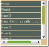
And this is what it looks like:

Styling a ListBox step 3

Kind of disappointing, huh? That's because we haven't styled the scrollbars themselves yet. Now we need to take a look at the default scrollbar style. Now these really are intimidating. They contain hundreds of lines of XAML with plenty of Storyboards and gradients. Even more confusingly they contain templates within templates.

We will progress by looking at each of these sub-templates one by one. First up is HorizontalIncrementTemplate, which is the right-arrow at the end of the horizontal scrollbar. Here's the default implementation:

<ControlTemplate x:Key="HorizontalIncrementTemplate">
    <Grid x:Name="RootElement" Background="#00000000">
        <Grid.Resources>
            <Storyboard x:Key="Normal State" />
            <Storyboard x:Key="MouseOver State">
                <ColorAnimation Duration="0:0:0.2" 
                 Storyboard.TargetName="ButtonColor" 
                 Storyboard.TargetProperty="Color" To="#FF557E9A" />
            </Storyboard>
            <Storyboard x:Key="Disabled State">
                <DoubleAnimation Duration="0:0:0" 
                 Storyboard.TargetName="ButtonVisual" 
                 Storyboard.TargetProperty="Opacity" To=".6" />
            </Storyboard>
        </Grid.Resources>
        <Grid.ColumnDefinitions>
            <ColumnDefinition Width="35*"/>
            <ColumnDefinition Width="30*"/>
            <ColumnDefinition Width="35*"/>
        </Grid.ColumnDefinitions>
        <Grid.RowDefinitions>
            <RowDefinition Height="25*"/>
            <RowDefinition Height="50*"/>
            <RowDefinition Height="25*"/>
        </Grid.RowDefinitions>
        <Path x:Name="ButtonVisual" 
         Grid.Column="1" Grid.Row="1" Stretch="Fill" 
         Data="F1 M 511.047,352.682L 511.047,342.252L 517.145,347.467L 511.047,352.682 Z ">
            <Path.Fill>
                <SolidColorBrush x:Name="ButtonColor" Color="#FF313131" />
            </Path.Fill>
        </Path>
        <Rectangle x:Name="FocusVisualElement" 
         Grid.ColumnSpan="3" Grid.RowSpan="3"  
         Stroke="#666666" Fill="#00000000"  
         StrokeDashArray=".2 5" 
         StrokeDashCap="Round" 
         IsHitTestVisible="false" 
         Opacity="0" />
    </Grid>
</ControlTemplate>

Although this looks like a lot of code, all that is happening is simply a triangle is being drawn. The grid simply serves to give an appropriate margin around the triangle. The animations change the colour for mouse-over and mouse-down. There is also a focus rectangle. The actual background to the arrow is drawn by another part of the template. So for now I will leave these as they are and to move onto the "Thumb" components.

I have simplified the thumb component to be a rounded rectangle that changes colour as you hover over it. I also played with the margins to make it a little thinner.

<ControlTemplate x:Key="VerticalThumbTemplate">
    <Grid x:Name="RootElement">
        <Grid.Resources>
            <!--Colors-->
            <Color x:Key="ThumbForegroundColor">#ACAC39</Color>
            <Color x:Key="ThumbHoverColor">#73AC39</Color>
            <!--Storyboards-->
            <Storyboard x:Key="Normal State" />
            <Storyboard x:Key="MouseOver State">
                <ColorAnimation Duration="0:0:0.1" 
                                Storyboard.TargetName="ThumbForeground" 
                                Storyboard.TargetProperty="Color" 
                                To="{StaticResource ThumbHoverColor}" />
            </Storyboard>
            <Storyboard x:Key="Disabled State">
                <DoubleAnimation Duration="0:0:0" 
                                 Storyboard.TargetName="ThumbForeground" 
                                 Storyboard.TargetProperty="Opacity" 
                                 To="0" />
            </Storyboard>
        </Grid.Resources>
        <Grid x:Name="ThumbVisual">
            <Rectangle x:Name="Background" 
                       Margin="4.5,.5,4.5,.5" 
                       RadiusX="5" RadiusY="5" >
                <Rectangle.Fill>
                    <SolidColorBrush x:Name="ThumbForeground" 
                       Color="{StaticResource ThumbForegroundColor}" />
                </Rectangle.Fill>
            </Rectangle>
        </Grid>
    </Grid>
</ControlTemplate>

With a similar change to the HorizontalThumbTemplate, our scrollbars are now finally beginning to change in appearance (n.b. To see the changes we have also had to modify our ScrollViewer style so that the two scrollbars it creates use the new ScrollBar style).

Styling a ListBox step 4

Finally we are ready to update the remaining parts of the ScrollBar template - HorizontalRootElement and VerticalRootElement. Both are made up of a grid containing four repeat buttons and a thumb. Two of the repeat buttons are for the increment icons, while the other two are the invisible parts either side of the thumb that you can click for a large change.

Again, the change is simply to get rid of a load of unnecessary stuff. In our case we are simply putting a thin rounded rectangle behind the thumb and invisible repeat buttons, with no background behind the small increment buttons. Here's the new HorizontalRootElement template:

<!-- Horizontal Template -->
<Grid x:Name="HorizontalRootElement">
    <Grid.ColumnDefinitions>
        <ColumnDefinition Width="Auto" />
        <ColumnDefinition Width="Auto" />
        <ColumnDefinition Width="Auto" />
        <ColumnDefinition Width="*" />
        <ColumnDefinition Width="Auto" />
    </Grid.ColumnDefinitions>

    <Grid.RowDefinitions>
        <RowDefinition />
        <RowDefinition />
    </Grid.RowDefinitions>

    <!-- Track Layer -->
    <Rectangle Margin="0,6,0,6" Grid.RowSpan="2" Grid.Column="1" 
        Grid.ColumnSpan="3" Fill="#FF404040" RadiusX="3" RadiusY="3" />

    <!-- Repeat Buttons + Thumb -->
    <RepeatButton x:Name="HorizontalSmallDecreaseElement" Grid.Column="0" 
       Grid.RowSpan="2" Width="16" IsTabStop="False" Interval="50" 
       Template="{StaticResource HorizontalDecrementTemplate}" />
    <RepeatButton x:Name="HorizontalLargeDecreaseElement" Grid.Column="1" 
       Grid.RowSpan="2" Width="0" 
       Template="{StaticResource RepeatButtonTemplate}" 
       Interval="50" IsTabStop="False" />
    <Thumb x:Name="HorizontalThumbElement" MinWidth="10" Width="20" 
       Grid.Column="2" Grid.RowSpan="2" 
       Template="{StaticResource HorizontalThumbTemplate}" />
    <RepeatButton x:Name="HorizontalLargeIncreaseElement" 
       Grid.Column="3" Grid.RowSpan="2" 
       Template="{StaticResource RepeatButtonTemplate}" 
       Interval="50" IsTabStop="False" />
    <RepeatButton x:Name="HorizontalSmallIncreaseElement" 
       Grid.Column="4" Grid.RowSpan="2" Width="16" IsTabStop="False" 
       Interval="50" 
       Template="{StaticResource HorizontalIncrementTemplate}" />
</Grid>

Here's what it looks like:

Styling a ListBox step 5

The bar alongside the vertical scrollbar is actually a very stretched horizontal scrollbar. For some reason, while it successfully uncollapses the VerticalRootElement, it does not collapse the HorizontalRootElement when you create a vertical scrollbar. After much frustration I discovered that this is a known bug in the current Silverlight beta.

So finally we have completely customised scrollbars for our ListBox. Please excuse my hideous choice of colours. I am not a designer! I hope to add one further post to add the remaining two features to make our ListBox complete:

  • Selected Item Rendering
  • Mouse Over Rendering

Friday 4 April 2008

Styling a ListBox in Silverlight (Part 1)

This post describes how to style a ListBox in Silverlight 2 beta 1. For an updated version for beta 2, please look here.

One of the challenges of styling a control like the ListBox in Silverlight is the sheer number of subcomponents it uses. A ListBox has its own template which includes a ScrollViewer and an ItemPresenter. The ScrollViewer contains Scrollbars which contain RepeatButtons, Thumbs etc.

My original idea was to make copies of the default styles and slowly change them to look how I wanted, but I soon realised that the sheer quantity of XAML would get very confusing. So I decided to take the opposite approach. Start with a very basic template and slowly add features until it looks right. So here is the most basic of all ListBox templates:

<UserControl.Resources>
  <ControlTemplate x:Key="ListBoxTemplate1">      
      <Grid x:Name="LayoutRoot">
          <ItemsPresenter />
      </Grid>
  </ControlTemplate>
</UserControl.Resources>

This simply presents the items, with no outline of any sort displayed. To test our template, let's add some items to a ListBox:

<ListBox HorizontalAlignment="Stretch"
         Margin="160,81,318,238"
         VerticalAlignment="Stretch"
         Template="{StaticResource ListBoxTemplate1}">
      <ListBoxItem>Hello</ListBoxItem>
      <ListBoxItem>World</ListBoxItem>
      <ListBoxItem>Item 3</ListBoxItem>
      <ListBoxItem>Item 4 with a really long name</ListBoxItem>
      <ListBoxItem>Item 5</ListBoxItem>
      <ListBoxItem>Item 6</ListBoxItem>
      <ListBoxItem>Item 7</ListBoxItem>
      <ListBoxItem>Item 8</ListBoxItem>
      <ListBoxItem>Item 9 out of bounds</ListBoxItem>
      <ListBoxItem>Item 10 out of bounds</ListBoxItem>
</ListBox>

This is what it looks like so far:

Styling a ListBox step 1

Next step is the border for our listbox. I want all the listbox items to be drawn on top of a filled rounded rectangle. To do this, I have added a Border control. I have given it some padding so we can actually see it, because the ListBoxItem template is currently drawing white rectangles over the top of it.

<Grid x:Name="LayoutRoot">
  <Border Padding="5" Background="#E6BB8A" CornerRadius="5">
      <ItemsPresenter />
  </Border>
</Grid>

This is what it looks like now:

Styling a ListBox step 2

So before we go doing anything further to the ListBox template itself (like adding scrollbars), let's sort out the item templates.

For this we need to create a new style - ListBoxItemStyle1. (n.b. I should really have created a style with a template in rather than just a template for the ListBox itself - see further down in this post.)

So here is a minimal ListBoxItem style:

<Style x:Key="ListBoxItemStyle1" TargetType="ListBoxItem">
  <Setter Property="Foreground" Value="#FF000000" />  
  <Setter Property="Template">
      <Setter.Value>
          <ControlTemplate TargetType="ListBoxItem">
              <Grid x:Name="RootElement">
                  <ContentPresenter
                      Content="{TemplateBinding Content}"
                      Foreground="{TemplateBinding Foreground}"
                   />                  
              </Grid>
          </ControlTemplate>
      </Setter.Value>
  </Setter>
</Style>

As you can see, it is a little more involved than the basic ListBox template. We needed to have the Foreground property set to a sensible default value (Black) for anything to appear. And we have simply used one ContentPresenter control to show the contents of each ListBox item.

We can tell our ListBox to use it by setting its ItemContainerStyle as follows:

<ListBox
  HorizontalAlignment="Stretch"
  Margin="160,81,318,238"
  VerticalAlignment="Stretch"
  Template="{StaticResource ListBoxTemplate1}"  
  ItemContainerStyle="{StaticResource ListBoxItemStyle1}"      
  >

Now we have got rid of those white backgrounds:

Styling a ListBox step 3

For the final step for this post, I will switch from using a Template to a style for the main ListBox control. This allows me to specify which ItemContainerStyle I want it to use. The only caveat is that ListBoxItemStyle1 must be defined before ListBoxStyle1 or Silverlight will throw one of its characteristically unhelpful errors.

<Style x:Key="ListBoxStyle1" TargetType="ListBox">
  <Setter Property="ItemContainerStyle" Value="{StaticResource ListBoxItemStyle1}" />          
  <Setter Property="Template">
      <Setter.Value>
          <ControlTemplate TargetType="ListBox">      
              <Grid x:Name="LayoutRoot">
                  <Border Padding="5" Background="#E6BB8A" CornerRadius="5">
                      <ItemsPresenter />
                  </Border>
              </Grid>
          </ControlTemplate>
      </Setter.Value>
  </Setter>
</Style>

This allows the style to be specified much more simply:

<ListBox
  HorizontalAlignment="Stretch"
  Margin="160,81,318,238"
  VerticalAlignment="Stretch"
    Style="{StaticResource ListBoxStyle1}"  
  >

Finally then we will make the item template just a little more interesting. I've added a border to the item presenter, and modified some margins and colours:

<Border CornerRadius="5" Background="#51615B" Margin="1">
<ContentPresenter
  Margin="1"
  Content="{TemplateBinding Content}"
  Foreground="{TemplateBinding Foreground}"
/>                  
</Border>

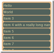
This leaves us with something looking like this:

Styling a ListBox step 4

So that is at least a reasonable start. Our ListBox is missing at least three crucial features though, which I hope to tackle in a future blog-post:

  • Scrollbars
  • Selected Item Rendering
  • Mouse Over Rendering

Thursday 3 April 2008

Who Cares About Audio?

Excuse me while I rant a little about audio. Why is there so much progress in the world of computer graphics, while audio is pushed to one side as a secondary concern?

Hardware

I bought my first ever laptop computer last month. I've been very pleased with it. It has 3GB RAM, a 2.2GHz dual core processor and a 320GB HDD. The graphics are a very competent NVidia 8600 chipset with 256Mb RAM. Pretty much everything about it is great. Except the audio. The speakers are atrociously tinny and have no frequency response at all below about 200Hz. The soundcard drivers for Vista are appalling. You can't connect the outputs to a PA system while the power supply is plugged in because they pick up too much noise. Why oh why do top of the range (OK middle of the range) laptops have audio components worth less than £5 in total?

Vista

The headline audio feature in Vista was a switch to a 32-bit mixing engine. The shocker was that XP was still mixing in 16 bit. The ability to adjust volumes from different applications is kind of nice, but is missing a crucial feature - the ability to mute the sound coming from other logged in user's applications. Very annoying if your children left themselves logged into the CBeebies website.

The transition to Vista has been painful for a lot of people, but surely no one more than users of pro audio. If you are using your computer with a pro soundcard, whether USB, FireWire or internal, chances were it didn't have drivers until a full year after Vista's official release. And the current state of drivers is still dismal, with most still in beta, latencies much worse than the XP drivers, and no sign whatsoever of 64 bit drivers on the horizon (with the refreshing exception of Edirol).

The much heralded WaveRT driver model has not been adopted by any of the major pro audio card manufacturers and all the promise behind WASAPI and MMCSS has not been realised. Some FireWire interfaces are being sold off on the cheap, presumably because they don't and never will support Vista (e.g. Tascam FireOne, Mackie Onyx Satelite). Vista is turning out to be a bad OS for a DAW.

.NET Framework

When the .NET 1.0 framework came out, I was disappointed that it included no audio APIs. I set about writing my own .NET audio library (NAudio), and experienced a lot of pain getting interop working with the WaveOut windows APIs. I fully expected that Microsoft would rectify this omission in the next version of .NET. After all, Java had some low-level audio classes in the javax.audio namespace even back then. However, .NET 1.1 came out and all we got was a rudimentary play a WAV file control. Nothing that couldn't be done with a simple wrapper around the PlaySound API.

So I waited for .NET 2.0. But nothing new for audio there. Or in 3.0. Or in 3.5. And the open source community hasn't exactly done anything much. NAudio has picked up no traction whatsoever, and over the last seven years, I have only come across a handful of similar projects (a few wrappers of unmanaged audio libraries here and there, and a couple of articles on CodeProject).

I find it astonishing that Microsoft are happy to leave vast swathes of the Windows API without any managed way of accessing it. It was perhaps understandable that they couldn't wrap the entire API when .NET 1.0 came out due to the sheer size of the task, but that most of the new APIs for Vista have no managed wrappers doesn't make any sense to me. Wrapping WASAPI will not be a trivial task, as as such it seems destined not to be used in .NET for the forseeable future. And though the WaveOut APIs may have been superceded, the MIDI and ACM APIs are still Windows only way of accessing MIDI devices and compression codecs.

Also disappointing is the fact that the managed DirectSound wrapper project has effectively been abandoned with no planned support for any .NET 2.0 wrapper assemblies. The March 2008 DirectX SDK still contains .NET 1.1 wrappers that trigger LoaderLock Managed Debugging Assistants when you try to use them in Visual Studio. All that we have on offer now is the XNA framework, which is solely focused on the game market, and therefore lacks the flexibilities needed for a lot of streaming low-level audio scenarios.

As for the de-facto standards of pro-audio, ASIO and VST, there seem now to be one or two small projects emerging to provide .NET wrappers. How cool would it be to create a VST plugin that allowed you to code in any language (VB, C#, IronRuby, IronPython) and compile it on the fly. OK, the garbage collection nature of .NET means that you will not be using it at super low latencies, but nonetheless, some very creative applications could be created. Yet at the moment, all the development time has to be put into getting the wrappers working, rather than on writing the end products.

Silverlight

Finally, what about Silverlight? The good news is that it supports MP3 and WMA. For most people that would be enough. But again, why does .NET offer us a stream-based audio API which we could directly manipulate samples before they were sent to the soundcard (i.e. a PCM WAV stream)? This would open up the way for all kinds of cool applications. Check out this astonishing Flash plugin for an idea of what would be possible. (interestingly, Flash developers are petitioning for more audio functionality, and they are already enjoying far more freedom than Silverlight offers). Microsoft, how about beating Adobe to the punch on this one?

Even the excellent Silverlight Streaming service is video-centric. You can include audio files as part of an application, but unlike video, you can't upload audio separately, effectively ruling out the possibility of just updating one audio file for an application that used many files.

Conclusion

Why is it that audio is so low on people's priorities? Year on year we see great progression in video cards, cool 3D rendering technologies like WPF, and Silverlight can do rotating translucent videos with just a couple of lines of XAML. But if you simply want to add some EQ to an audio stream, be prepared to write mountains of code, and tear your hair out debugging the exceptions when the garbage collector moves something that should have stayed where it was.