Styling your own custom progress bar in WPF has always been a relatively straightforward task. I blogged about how I created a volume meter style several years ago. But recently I needed to create a style for a vertical progress bar, and it proved a lot more complicated than I anticipated. The root of the problem appears to be a breaking change in .NET 4, that meant your PART_Indicator’s Width rather than Height gets adjusted, irrespective of the orientation of the ProgressBar.
It means you end up with vertical progress bars looking like this:
Instead of what we want which is this:
The trick to fixing this is to use a LayoutTransform as described in this StackOverflow answer. The transform rotates the root element 270 degrees when the ProgressBar’s Orientation property is set to Vertical. If this sounds a bit of a hack to you, well it is, but it does seem to work.
The XAML for the style shown above is as follows:
<Style TargetType="ProgressBar">
  <Setter Property="Template">
    <Setter.Value>
      <ControlTemplate TargetType="ProgressBar" >
        <Grid x:Name="Root">
          <Border
            Name="PART_Track"
            CornerRadius="2"
            Background="LightGreen"
            BorderBrush="Green"
            BorderThickness="2" />
          <Border
            Name="PART_Indicator"
            CornerRadius="2"
            Background="ForestGreen"
            BorderBrush="Green"
            BorderThickness="2"
            HorizontalAlignment="Left" />
          </Grid>
          <ControlTemplate.Triggers>
            <!-- Getting vertical style working using technique described here: http://stackoverflow.com/a/6849237/7532 -->
            <Trigger Property="Orientation" Value="Vertical">
              <Setter TargetName="Root" Property="LayoutTransform">
                <Setter.Value>
                  <RotateTransform Angle="270" />
                </Setter.Value>
              </Setter>

              <Setter TargetName="Root" Property="Width"
                Value="{Binding RelativeSource={RelativeSource TemplatedParent}, Path=Height}"
              />
              <Setter TargetName="Root" Property="Height"
                Value="{Binding RelativeSource={RelativeSource TemplatedParent}, Path=Width}"
              />
            </Trigger>
          </ControlTemplate.Triggers>

        </ControlTemplate>
    </Setter.Value>
  </Setter>
</Style>
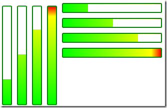
One word of caution. If you plan to plan to use the gradient fill and dock panel technique I described in my blog, then you’ll need another trigger to set the MinWidth property on the Mask element. This allows you to get the gradually revealed gradient fill in either Horizontal or Vertical alignment:
I’ve made the XAML for these styles available in a gist on GitHub.


No comments:
Post a Comment